Marco's Fade Salon
A concept build for a barbershop and salon under one roof — prices on the page, two booking paths, built for the phone in someone's hand.
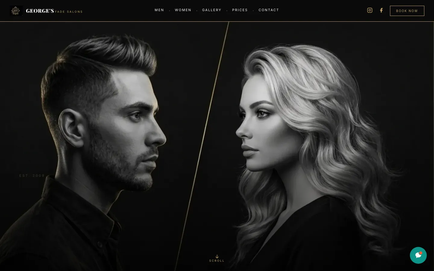
Prices, portfolio, and a booking button visible without scrolling — the three things someone standing outside your shop is actually looking for.
Built for the customer standing outside deciding whether to walk in.
Service prices published on the page — $40 skin fade, $30 beard sculpt, colour from $100 — not hidden behind a call
Top-level MEN and WOMEN navigation, so each customer lands in their own half of the business
Two location blocks, each with its own address, phone number and opening hours
Booking prompts repeated at eight points down the page, not parked once in the footer
A portfolio section that shows the actual work, because a haircut is bought with the eyes
Dark, phone-first layout that stays legible in daylight on a sidewalk
What a barbershop website is actually for
It is not there to impress anybody. Someone is standing on a sidewalk with a phone, deciding whether to walk through your door or keep walking. They want three answers, in this order: what does it cost, is the work any good, and how do I get in the chair. Every second between the tap and those three answers is a chair you did not fill.
Most barbershop sites get the order backwards. They open on a full-screen video, put the price list behind a PDF, and leave the booking link in a hamburger menu. The site looks expensive and converts badly. We built this one to answer the three questions before the visitor has to look for anything.
Two businesses sharing an address
Marco's is a barbershop and a hair salon in neighbouring units. That sounds like a detail. It is actually the whole information architecture, because the two sides have different customers, different price points, different hours, and different reasons to book.
So the navigation splits at the top level — MEN and WOMEN — before anything else. Each side gets its own landing section, its own portfolio, and its own booking button: "Book for Men" and "Book for Women" are separate calls to action that go to separate places. The two units are listed as two locations, each with its own street address, phone number and hours, because the barbershop runs seven days and the salon closes Mondays and Sundays. One combined hours block would have been simpler to build and wrong for half the visitors.
If you run two services out of one address — barbering and colour, grooming and spa, repairs and retail — this is the pattern worth copying. Split at the navigation, not three levels down.
Prices on the page, not behind a phone call
The most common objection we hear is that publishing prices scares people off. In a walk-in trade it does the opposite: it scares off the wrong people, before they have taken up twenty minutes of your day asking. The customer who books after seeing $40 on the screen is a customer who has already agreed to $40.
The trick is publishing a number without painting yourself into a corner, and the price list here shows all three ways to do it. Fixed services carry a flat figure — a skin fade is $40, a beard sculpt is $30. Variable work carries a floor: colour and highlights read "From $100", which is honest and still gives room to quote up. Genuinely bespoke work carries no number at all — bridal is "By consultation", which reads as considered rather than evasive because it sits next to real prices.
You almost never need to hide the whole list. You need one of these three formats for each line on it.
Eight ways to book, one place to land
A visitor does not decide to book at a fixed point on the page. One decides at the price list. Another decides at the portfolio, two screens further down. A third decides only after checking that the hours suit them. If the booking prompt sits in one place, you capture whichever group happens to be standing there.
There are eight booking prompts on this build — in the navigation, after each service section, under the portfolio, and beside the location details — and every one of them lands in the same place. That is the part people get wrong when they add more buttons: multiple destinations feel like a maze. Multiple prompts, one destination, feels like good service.
Four things you can check on the live site right now.
- 1Open it on a phone and time how long it takes to find a price. It should be one scroll.
- 2Tap MEN, then WOMEN, and watch the whole page change context rather than jumping to an anchor.
- 3Scroll the two location blocks and compare the opening hours — they differ, deliberately.
- 4Count the booking buttons on the way down, then check they all lead to the same place.
Want a site like this for your shop?
Book a free consultation. We'll show you what we'd build for you, and what it would take.